AmLaw Global 50 Aggregate Scores
| # | Score | Description |
|---|---|---|
| 1 | 62.1 | Clear and differentiating positioning strategy |
| 2 | 92.5 | Practice and industry focus are apparent |
| 3 | 89.3 | Geographic reach is apparent |
| 4 | 76.6 | Contact information is clear and easy to find |
| 5 | 74.0 | Site features or links to alternate language translations |
Top Trends + Insights
Two of the attributes – practice and industry focus are apparent and geographic reach – scored lower than they did in 2016. The other three attributes scored higher.
In terms of featuring content in alternate languages (attribute #5), as a group, the AmLaw Global 50 improved a great deal in demonstrating their commitment to their global clients and employees. The average score this year was 74.0, up from 40.3 in 2016.
- Yet, 13 firms still have no translated content that we could find of the 37 firms with translations, the average number per firm was 4.2 languages.
- Translations are rarely as detailed as the original English site – oftentimes only headers are translated.
- Certain firms promote themselves as "seamlessly global" with impressive strides toward equity, diversity and inclusion, yet do not equally communicate with visitors whose native language is not English.
Many firms still use “Contact us” forms, even if they include a general email (such as info@lawfirm.com). It makes us wonder what kind of valuable queries they receive that supports them continuing to include a form. Given the nature of their clientele, we can’t imagine that those buyers or even lawyers interested in working there would fill out a form.
As noted in the Executive Summary, the existence of Positioning Strategy has improved by 16 points but is still too generic and uninspiring. In the 2016 Study, any strategy was too fleeting with the high number of rotating carousels on the home pages – the headlines and images disappeared too quickly. We still see some of this in 2020. Thankfully, the number of carousels has decreased significantly – generally in favor of long, scrolling home pages.
- 17 firms had no positioning strategy whatsoever. This is only four firms better than in 2016.
- Too many firms are burying their strategy in the ABOUT section (in both text and video). Your firm's strategy is its stake-in-the-ground – it helps us to understand and care about you. Please don’t hide it!
Speaking more about long-scrolling . . . In our website design work, we find that lawyers either love long-scrolling or vehemently oppose it. This discussion could be limited to what follows in FBP2 - Design, but because FBP1 - Communicating your Message is largely about the first impression your website makes, we also include it here. What are the practical advantages of long-scrolling home pages?
You want visitors’ “dwell time” to be longer on your website. One of your goals should be to lengthen the time they spend on each of your pages. Build engagement into your home page by featuring your most relevant, important stories – invest in your visitors by focusing on their journey.
Remember, when everything appears in a long alphabetical list, the weight of each practice is the same to your visitors. Consider a more innovative taxonomy to highlight your super-strengths.
- Long-scrolling hails to mobile – everyone does it and expects it.
- It gives users a sense of control, which, when tested, is important for visitor satisfaction with your site.
- Visitors navigate long-scrolling sites at their own pace, lingering on relevant content and clicking to “read more” or ignoring panels of content that aren’t interesting to them. Again – this goes to their feelings of control. Interested visitors can consume important and interesting content without having to click. This creates a more reliable and seamless experience.
The biggest challenge website planners have is answering this question: How much scrolling content is too much? Will it overwhelm? And what kind of content is best on the home page?
Still too many firms make awards and recognition the primary their focus of their home pages – it’s not client-focused or visitor-related – at all.
- Too much “all about me.”
When we conducted the 2016 research, Brexit was the big news story and the majority of firms were telling the same story. The firms that stood out were those that offered fresh and unique points of view. In Q4 2019 when we completed our research, there wasn't a comparable global-impact story — the COVID-19 coronavirus news hadn't broken yet. But as we write this White Paper in Q1 2020, it's covering the home pages of all major law firms. When there isn't a global news story the home page news often relates to specific deals and cases handled by the firm. This is a very positive change – a firm’s precise experience makes them truly unique.
The cliché of the various iterations of “global reach, local expertise” isn’t distinguishing and it is far too popular. Take our challenge: prove this global/local claim with actual client stories and solutions – then communicate it in a unique way.
One more cliché is overused: other word pairs that are not clever or differentiating – too many firms fall into the habit of using exactly the same words.
Website taxonomy could improve. In fact, for practices and industries it declined a few points from 2016. 21 firms scored 100.0 on “Practice and Industry focus are apparent” and several others scored 90.0. But those that scored lower were because practices and industries weren’t separately delineated or they were overly dense and hard to consume.
Standout Firms for Positioning and Strategy
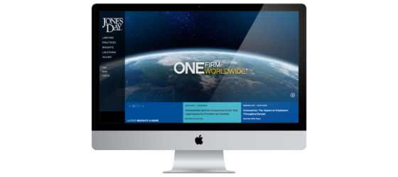
Jones Day
While several firms have borrowed the sentiment and claim some version of it, Jones Day’s tagline “One Firm Worldwide” has been distinguishing since the firm launched its last site in 2007. A video under "VALUES" in the global navigation tells clients what it means and also tells lawyers who are evaluating employment options. It is a powerful message that is enduring and that Jones Day pays off.
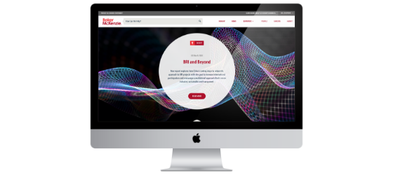
Baker McKenzie
Good positioning under ABOUT US – “The New Lawyers for the New World” accompanied by a compelling video that reviews all their firsts. But friends, please put this on the home page – don’t make us hunt for it.
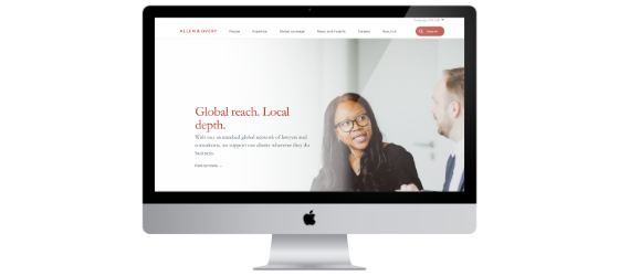
Allen & Overy
Good positioning statement right up front that suggests how they do business – “Innovation as usual.” This strategy copy follows: “The world’s top companies rely on Allen & Overy to solve their most complex legal and business challenges.”
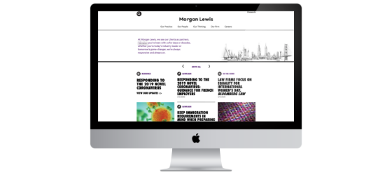
Morgan Lewis
Our #1 firm in the 2016 Study, Morgan Lewis includes solid strategy copy prominently on the home page. This sets a visitor's expectations of what the firm offers and how they do business. "At Morgan Lewis, we see our clients as partners. Whether you’ve been with us for days or decades, whether you’re today’s industry leader or tomorrow’s game-changer, we’re always responsive and always on." While calling clients “partners” is not distinguishing and is over-used, the rest of it stills feels fresh and interesting.
CMS
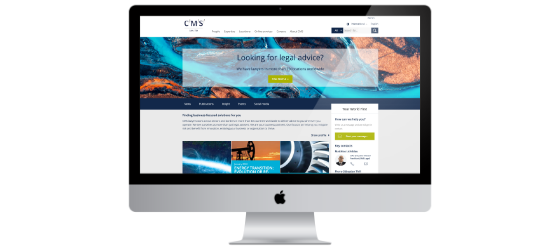
We love “Your World First” because it’s client affirming, pithy, and strong. It is a missed opportunity not to have it more prominently on the home page (it lives off to the right above a "how can we help you" box). Also – there is a video in the ABOUT CMS megamenu that is really good and that tells a great story.
Quinn Emanuel
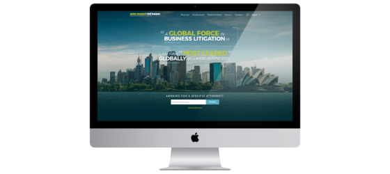
They put their stake in the ground on the home page via their rankings, which isn’t unique, but the firm has been committed to this approach at least since the 2016 Study. However, this is actually less compelling than the large, bold text on The Firm & News landing page: "Litigation Is A Zero Sum Game. There Is A Winner And A Loser. We Know How To Win." (Note to the firm: Zero-sum should be hyphenated in this use.)
Milbank
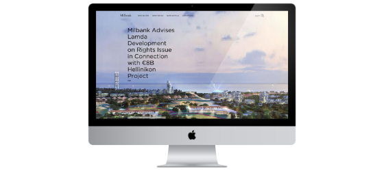
While we believe this unique statement should be on the home page, at least it appears at the top of the WHO WE ARE page: "The merger of excellence and grit.” Countless firms talk about “excellence,” but we’ve never seen it combined with something quite as earthy as “grit.” Good one, Milbank.
Standout Firms for the Other FBP01 Attributes
Cooley
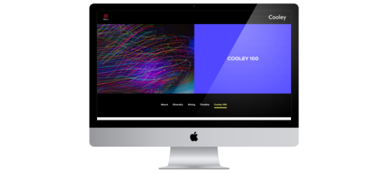
We love this quippy video about Cooley's centennial: Cooley 100. One might think it’s a traditional blah-blah about firm history, but instead a bunch of people say what their favorite numbers are. It’s brimming with personality and is clever and fun.
Norton Rose Fulbright
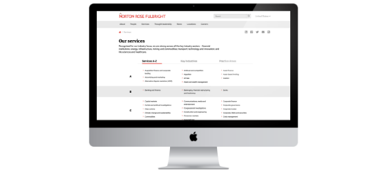
This website doesn’t just separate practices from industries, it lets the visitor choose how they want to search for them on the SERVICES landing page. They offer three options.
Eversheds Sutherland US
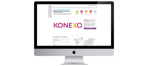
The firm offers 19 languages, the highest number by a long shot. The only firm that offers Slovakian, Czech, Latvian and Lithuanian translations.
Covington
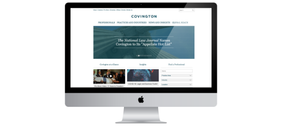
There is no home page positioning, but under ABOUT (which is at the top left in the secondary navigation), there are three short videos that tell smart stories. We hope site visitors will be curious enough about the firm to find these and view them. All three videos are spoken by Timothy Hester, the firm chair.
Goodwin
Notice the sticky navigation on the home page. We saw very little of this among the Global 50 firms. Also called “persistent navigation,” it is a fixed navigation menu on a web page that remains visible and in the same position regardless of where the visitor is on that page. As the visitor scrolls down and changes location on the home page, where you are in the sticky navigation changes right along with you.
Do's
| Do comply with your state or country’s advertising regulations. Do they permit you to use words like “successes, results, wins?” | |
| Do tell compelling stories – use infographics to help build your brand and tell firm stories, successes, global reach, awards, etc. | |
| Do a better job of presenting practices and industries. Simplicity is best – users want clarity and an intuitive list that’s well organized by the top services you provide. Organize by what clients buy from you, not how your firm is structured. | |
| Do make it easy to toggle among languages on any given page. | |
| Do include interactive maps on the “locations” or “offices” page – these are a helpful and engaging way of visually displaying global reach. | |
| Do share your strategy right up front – it should be clear – not hidden in the footer or on an ABOUT page. | |
| Do make your home page welcoming. Ensure that your home page content lingers long enough before changing (such as in a carousel) for visitors to scan and grasp it. Let them get their bearings on your site (three to five seconds) – help them feel at home. | |
| Do include a general email (info@lawfirm.com) instead of insisting on long, tedious contact forms. |
Don'ts
| Don’t fall in love with a positioning strategy without first analyzing what your peer and competitor firms are saying. In many cases, they are saying the same thing. | |
| Don’t forget to program your copyright notice in your footer to change each January 1 to the new year. | |
| Don’t use the word “international” or “foreign” when describing your office locations outside your home country. This is a we-aren’t-really-global trip-up that depicts your firm as too U.S. or Europe-centric. | |
| Don’t rely on your awards and rankings to differentiate you. At the level these firms are competing, unless it’s a pro bono, diversity or charitable/community award, they often aren’t differentiating at all. |
FBP1 Total Scores
Top Ten Performers
Two firms tied for 10th place so we are including both of them here.
