AmLaw Global 50 Aggregate Scores
| # | Score | Description |
|---|---|---|
| 1 | 87.5 | First 2-3 sentences of overview are descriptive of lawyer's practice, type, size and industry sector of clients represented, plus geography or practice |
| 2 | 70.0 | Bio uses the professional's first name or nickname (not Mr. or Ms.) |
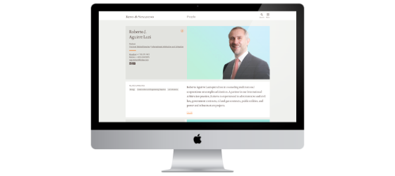
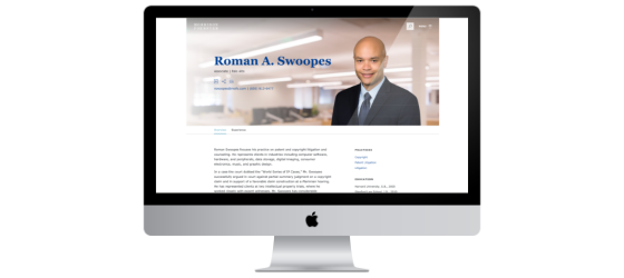
| 3 | 48.0 | Photos are larger format, "magazine-style" and consistent; They convey the professionals' personalities |
| 4 | 87.0 | The professionals' fill contact information is easy to find |
| 5 | 57.2 | The professional proves s/he/they is highly accessible: a) social media links, b) email this page, c) print, d) vcard, e) they list their assistant's contact info |
| 6 | 81.8 | Bios crosslink to practices/industries/news-events, etc. Firms get points off if they list items that don't link |
| 7 | 74.9 | Lawyers' bios include detailed experience/matter lists that are well organized with line breaks, sub-heads, etc. Avoids repetition of words and phrases, particularly at the beginning of bullet-points: e.g., represented, advised |
| 8 | 72.6 | Page design supports elegant content organization that enables visitors to quickly scan and consume what they want - e.g., easily "consumable" containers, boxes, headers, sub-heads, bullet lists, etc. No long, dense, unbroken blocks of text |
| 9 | 71.8 | Associates and professional staff (such as CFO, CMO, COO, etc.) have full biographies, which are accessible from the People landing page |
Top Trends + Insights
If you’re seeking a tutorial on how to dramatically improve your lawyer bios, listen to this 28-minute podcast with Deborah McMurray. Moderated by Scott Love with the Attorney Search Group, it is practical and proven advice.
Analytics continue to prove that the reason visitors come to a law firm website is to view the bios. 50-75% of all visitors on the analytics we track view lawyer biographies. They must work harder for you.
The bio photo may be the bane of a lawyer’s professional existence, but it remains a critical element in shortcutting the pathway to trust. By today’s high standards, too many of the Global 50 firms scored poorly on their professional photos – the average of the 50 firms was 48.0.
- Several firms use the phrase “one-firm” in their ABOUT section descriptions, yet we will see lawyers in different offices using different colors, backgrounds and image styles. Consistency in photo style is key in promoting “one firm” and a memorable firm brand. (NOTE: This doesn’t mean that the lawyers’ poses and expressions should be exactly the same. “Tone” and format of the images should be consistent – that’s what we’re looking for.)
- Only four firms scored 100.0 on attribute #3 – “Photos are larger format, "magazine-style" and consistent; they convey the professionals’ personalities” – White & Case, Cooley, McDermott Will & Emery, and Proskauer.
The attribute with the second-lowest score in FBP4 - Professionals' Biographies was #5 relating to the person’s accessibility (not to be confused with WCAG accessibility compliance discussed in FBP10 - Site Hygiene + Usability). The average for the Global 50 firms was 57.0.
- The highest score awarded for this attribute was 80.0 – 12 firms were leaders in including links to their social accounts, as well as other sharing options.
- If you believe this is important (as we do) and you want to give your lawyers examples of Global 50 firms that are doing this, we are listing all dozen of these firms by name: Latham & Watkins, DLA Piper, Skadden, Dentons, Jones Day, Freshfields, White & Case, CMS, Herbert Smith Freehills, Morrison & Foerster, Goodwin, Winston & Strawn.
- Why should lawyers care about this? To create relationship stickiness and to eliminate any communication barriers. When competition is increasingly tough, the person who makes it easier to do business with them just may come out on top.
15 firms scored 100.0 on “full contact information is easy to find.” You wouldn’t think this would be hard, but in some redesigns such foundational things are slipping. Firms scored a 99.0 on this in 2016 – but they have slipped to 87.0.
13 firms scored zero on attribute #2 – “Don’t use Mr. or Ms. Use the person’s first or nickname.” Please stop doing this. With the ease of casting aspersions and judgment today, you are creating a barrier to entry and intimacy. It doesn’t set you higher on the professional ladder – it just makes you seem remote and unapproachable.
Buyers of legal services want to know four things: what have you done, for whom have you done it, how will you do it and what can you do for me?
The lawyers/firms that do a good job with their experience do a very good job. There were no firms that scored zero, but two scored 10.0 (“unacceptable”) and several others scored 60.0 or below. Too few sites turned experience details into a reader-friendly illustration of the lawyer’s practice focus and strengths. Don’t forget to teach associates how to master presenting these details. Associates’ experience details were often non-existent or light. A shout-out to Kirkland & Ellis for consistently sharing excellent detailed experience (even on associates’ bios), as well as Skadden, Jones Day, Dentons, which did a fine job with subheads and non-repetitive titles for each entry, and Sullivan Cromwell. All these firms scored 100.0 on this attribute.
With the redesigns since the 2016 Study, firms have done a better job organizing bio pages so they are more consumable. We are looking for smart design that presents an intuitive and accessible information hierarchy, the use of containers, headers and subheads, bullet lists and otherwise ways to better present bio information.
- 12 firms scored 100.0 on this attribute, with several other firms scoring 90.0.
- The most engaging sites more effectively used headers, different font sizes and styles to capture the visitor’s attention.
Professional staff and associates too often do not have bios (if they do, they are lacking in information that could be relevant to your visitors). Most often, sites feature either administrative professionals OR associates – not both.
Strangely, professional staff and associate bios are often not the beneficiaries of the website’s full search features. Rather, they are merely listed on a page of firm management without full bios. When associates are billed to clients at U.S. $500 or more per hour, they deserve full bios.
Experience lists are almost always too long, randomly organized and don’t adequately answer a prospect’s short-list questions. Learn how to be a good storyteller in 140 characters to 2 sentences.
- If they have experience at all, too many are extensive bulleted lists of blandly written accomplishments with too much jargon and not enough meaningful specifics. Remember: buyers’ short-list questions include what have you done, for whom have you done it, how will you do it — then, what can you do for me. You must answer these questions first to have any chance at being hired.
Professionals are mostly wasting the rich opportunity offered by the bio Overview. Too many merely re-state their title, office location, practice group membership, academic credentials and other obvious data (that are listed elsewhere on the page) without differentiating the professional or the firm. The first two sentences of your bio (another way of saying this is the first 140 characters) are the most important online real estate most lawyers will ever own. This is critical for search engines (because few firms take the time to write good meta-descriptions on a page by page basis) and human visitors alike.
As a truly global photography agency, we asked GittingsLegal leaders to comment on what they are seeing today and anticipating in portrait photography during this decade. They’ve been photographing lawyers and other law firm personnel since 2011 and have photographed nearly 60,000 lawyers in all 50 states and more than 228 cities around the world. “A resounding and consistent request we receive when working with a firm is that they want their lawyers to look ‘approachable.’ But in Deborah McMurray’s podcast about website bios, she mentions how lawyers can shortcut the pathway to trust. Trust goes much further than mere approachability. “There are several ways that trust (or trust-worthiness) can be conveyed in a portrait."It’s the initial impression that a visitor has when seeing the lawyer’s image for the first time. Research is clear that we all make a judgment within milliseconds of viewing a photo of someone. Are they nice? Could I work with this person? Are they smart? Can they get the job done? Can I TRUST this person?
"As the photo is unconsciously processed by the viewer, a deeper evaluation occurs. Is this a genuine expression? Is this person self- conscious, egocentric or down to earth? Do they care more about themselves than they would about me, my challenge or company? Would they have my back? Can I TRUST this person? "Upon meeting the lawyer for the first time, this person’s now ‘second’ impression tries to reconcile the new impression with what the website visitor saw in the photo on the bio page. Does this look like the same person? Just a different haircut, or is it something else? Does the photo portray a 10+ year younger version of this lawyer? A markedly thinner or heavier appearance? Why haven’t they updated their photo? Do they not like their appearance today? Are they too busy to get a new one taken? Will they have time for me? Can I TRUST this person? “Having the lawyer look simply ‘approachable’ isn’t sufficient anymore. Approachable is nice, welcoming and safe, but we see that as table stakes. As buyers, we want more – to be able to trust our lawyers, to know that they will be there for us. The right portrait can set the stage for this to occur.”
Standout Firms
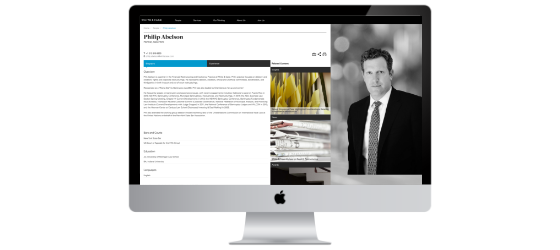
White & Case
Came in first on FBP4 - Professionals' Biographies with the best bios we’ve recently seen. The page organization is intuitive and visually appealing, the photos are large, magazine-style and show personality. The descriptive copy and experience are very good across the board, even for associates and staff. Crosslinking is well populated and draws your eye with imagery and placement, within a "related content" area. Tab structure is kept simple (biography and experience). Good page tools, social and sharing.
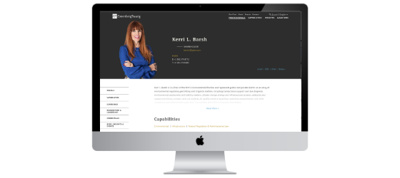
Greenberg Traurig
Came in second with strong written content and large format pictures. The page organization is outstanding with consumable containers that one can navigate according to preference (scroll or click), with transition effects that make the page feel engaging and modern. Experience is well populated and organized. Good crosslinking with options to filter insights by type.
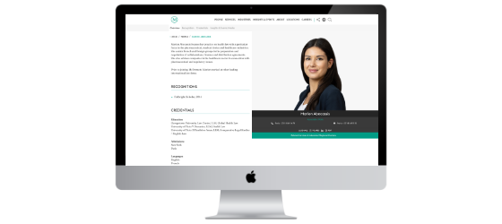
McDermott Will & Emery
Tied for third with very good bios, both in terms of content and structure. Large, magazine style photos. Persistent navigation that allows for scrolling or clicking, with the ability to expand individual content areas. Crosslinking is well populated, displayed attractively and organized with filter options. Experience is substantial and found on most partners’ bios. Nice button-less search with progress bar showing it's working. Full bios for associates and staff.
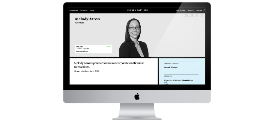
Cleary Gottlieb
Also tied for third with strong content that is well organized and consumable – both in terms of how it's organized and the styling – scanning feels easy. Good photography that shows personality. Full bios for associates and professional leadership. Experience is robust on almost all partners, and when long, it's broken into subheads and includes a “Read More.”
King & Spalding
Tied for third with well-organized pages that are easy to scan and attractive blocks of a different color. Suggestion: It could improve if the visitor experience were more consistent when you click the "More" links within each block – sometimes it expands down, sometimes a pop-up window appears, and other times it opens search results and you've left the bio. Good photography and bios for both associates and the team of other professionals.
Morrison & Foerster
The final firm that tied for third includes quotes from the lawyers, which are good, but we wish more people had them populated (seems about 3 in 10 partners). Intros are mostly good, and the photos are appealing. Social, sharing and page tools are easy to find. For the partners that include it, experience content is good and utilizes expand/contract to show more details. (We urge more MoFo partners to complete their experience profiles!) There is an interesting effect with how the header gets smaller as you scroll down, but keeps the contact info visible. Associates and staff have full bios.
Do's
| Do immediately engage the reader in your most relevant content: your first 140 characters should be keyword rich and relevant enough to compel visitors to click on this snippet in a Google search for your name. | |
| Once on the bio details page, do focus on your first 2-3 sentences – they should describe what you do today, the type, size and industry sector of clients represented, and the geography of your practice. | |
| Do provide an easy and intuitive search tool for finding professionals – this is one of the most important features on your website (make it easy to find your lawyers in multiple ways). According to the analytics we track, the alphabet search for Professionals is still the most-used search feature. | |
| Do provide full contact information (including your snail-mail address), accessible without scrolling and accessible without having to download a v-card. | |
| Do prove that you are accessible. Include social media links and visitor-friendly page tools, email this page, print to PDF, v-card and assistant’s name and contact info on the professional’s page. | |
| Do cross-link everything that is listed on the professional’s page (articles, events, blog posts, practice and industries, etc.). | |
| Do organize bios so they are easy to consume – with containers, boxes, headers, subheads, bullet lists, etc. | |
| Do ensure that associates and professional staff such as CFO, CMBDO, COO, etc., have full bios and are retrievable via the same search tools as your lawyers. | |
| Do answer the all-important 4 questions: What have you done? For whom have you done it? How will you do it? And, what can you do for me? | |
| Do prove that you are client-centric. Ponder the question: “what sells you?” – this will help you determine what visitors in your unique markets/industries are looking for from you. | |
| Do humanize your professionals through magazine-style, current photos and client-facing content. |
Don'ts
| Don’t refer to yourself as Mr. or Ms. – it’s old-fashioned and unfriendly. (Do you really expect someone to call you this?) Use the professional’s first name or nickname, and maintain consistency. | |
| Don’t clutter your bio by listing articles/events, etc. that aren’t cross-linked. | |
| Don’t repeat words and phrases over and over, especially at the beginning of your experience bullet lists (e.g., represented, advised). Vary your narrative choices to better engage your visitors – be a storyteller and present what you’ve done in a more interesting light. | |
| A colossal don’t: Don’t stay in love with your 10-year old photo, where you were 20-pounds thinner and had more hair. Be proud of your current appearance and update your photos every time your looks significantly change. We know it’s expensive to re-shoot thousands of professionals around the world, but given that these pages are driving the future revenue of your firm, it’s worth the investment. It’s a trust thing. Your prospect wants to know who you are today. |
FBP4 Total Scores
Top Ten Performers
5 firms tied for 10th place so we are including all of them here.
